Share |

Saturday, January 25, 2014

Digital Fusion? Thoughts on the Nikon Df


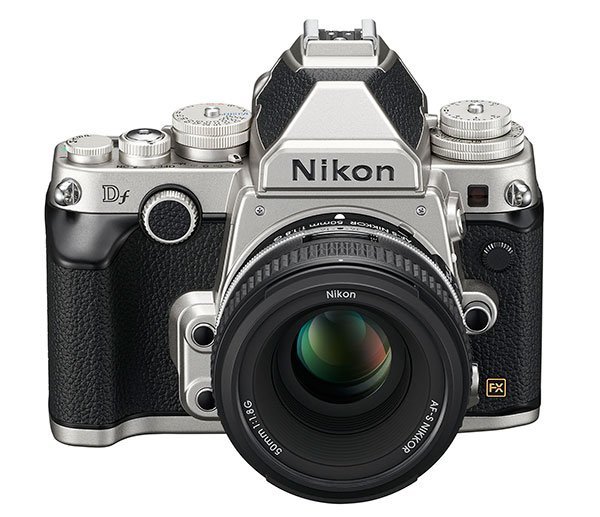
This is the Nikon Df. Announced on 5 November 2013, this debut design took three years to develop. Its name, short for Digital Fusion, represents its fusion of "D4 image quality and lightweight mobility". Behind this, though, its true intention and appeal also lies in mimicking the design of the film camera Nikon FM2, thus achieving a fusion of old familiarity and fresh technology. It comes with a specially designed Nikkor 50mm f/1.8G lens to match the body.

The essence of what's in this body: the same 16 MP full frame sensor as the D4, the same 39-point AF system (MultiCam 4800) as the D610/D600, and an EXPEED 3 processor. And in the name of pure photography, there is no video on this camera. It is the only digital body that is compatible with non-AI lenses, due to a foldable coupling lever design.

Seeing the sudden uproar over this camera - I've seen one by Fstoppers, one by DigitalRevTV - and I thought it's a good time I share my opinions too.

Rants, rants, rants.

I was actually quite appalled to hear that Nikon took three years to develop this camera. You might have noticed that this camera is essentially just a recombination of existing camera parts encased in a new body. It's like how McDonald's decided to replace the sausage patty in the McMuffin with that from a McChicken, and launch a whole new breakfast menu item called the Chicken McMuffin. Similarly Nikon grabbed the sensor of the D4, the AF system of a D600, and threw them together into a retro-looking body. That surely wouldn't have taken three years?

Furthermore Nikon has been pretty boring recently. The last major excitement was perhaps the D7000 in 2010, and the D4 and D800 in 2012 (the D600 honestly was no excitement at all), and I highly doubt the fast rolling D3000 series and D5000 series are worth much notice to serious photographers. The Df, everyone thought, could be the next big thing for Nikon. It was, but in a wrong way, for the main attractive thing of this body was the esthetics.

I was also disappointed that Nikon removed the video mode, because even though in the name of "Pure Photography" video should be unimportant, it's always a win to have this feature at hand. Furthermore, how much space (and cost) did Nikon actually save on this body by removing a built-in microphone and a few extra ports?

Of course, I could dig into details, like the lack of a built in viewfinder cover (and how much space did that save?) or the combined card and battery slot, or the weird front wheel design, but there's really more important things to get agitated over.

But it's not so bad.

Now let's not thrash this camera flat to the ground, shall we?

Nikon marketed this camera as a lightweight camera with D4 image quality. At less than half the price of the D4, it seems like a good choice to get a pro sensor. But unless you're really seeking the identical D4 sensor, it would perhaps make more sense to throw in a few more bucks and get a D800, with a better AF system. Of course, make sure the vast 36 megapixels won't bother you.

Many reviews criticize the controls on this camera. For this, I shall compare, like all others, to another retro-style digital camera that has garnered loads of positive reviews and thumbs-ups from pros, and has also been termed unofficially the "new Leica" or the "poor man's Leica": the Fujifilm X100s. For the sake of this comparison, let's just focus on the top panel controls.

Top panel of the Fujifilm X100s.

The X100s features a shutter speed dial, an exposure compensation dial, and an aperture ring. It did away with the mode dial; how I go about using different modes is via the Auto setting on both the aperture ring and the shutter speed dial. Whichever setting I would like to have adjusted for me using metering, I will turn it to Auto. Very intuitive, yes?

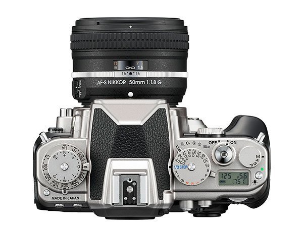
Top panel of the Nikon Df.

On the Df, the same dials exist on the camera, plus an ISO dial (this is inconsequential). And there's a small mode dial retained at the corner. This I do not mind, even though it may be confusing say looking at your shutter speed dial and forgetting that you're on aperture priority. But the complaint for this is that the dial is designed such that you have to lift the dial to turn it. And that, while preventing any accidental mode changes, is exceptionally hard to use. Bad move, Nikon. You could have used Fujifilm's ingenious method (though of course on the Nikon there's no aperture ring because that depends on the lens), or use a button+dial method like on pro bodies like the D800 and D4.

Then let's bring our attention to the one-third stop option on the Df shutter speed dial. You would observe that all the shutter speeds available on the dial are, as expected, in full stops. By selecting the one-third stop option, you are essentially back to normal DSLR operations, meaning using the back wheel to change shutter speed. On the X100s, though, for every shutter speed you select on the shutter speed dial, you can fine-tune it with the back wheel (which isn't really a wheel though). For the sake of using the camera retro-style, the X100s design definitely wins, but for practicality, it would vary from person to person. I would personally prefer the Df design, as I have the convenient option to revert back to my typical DSLR controls when I feel like it.

I've touched the Df a few times, and compared to the feeling of a retro compact X100s and a typical bulky DSLR, I can't really tell where the Df stands. Its grip denies me gripping the camera the X100s or the Nikon FM2 way, because the small bulge is obstructive. Yet when I grip it the DSLR way, it doesn't feel really safe either. But no doubt this camera is heavy and really quite big, a bit too big to be disguised as a Nikon FM2 equivalent. Though that's inconsequential. And overall it's still a decent design, just one you need to get used to.

A photographer I met in a park was actually using the Df. I asked him why. He said it renders colors better than other cameras. He owns a D4 as well, so I assume this means there is a difference. It's just like how D7100 and D5300 both runs on similar sensors and processors, but I trust the D7100 would beat the D5300 in the images it produces. In other words, it won't be the same EXPEED 3 in two different models. However I've not seen anyone else mention this benefit of the Df.

The lens is as modern as ever.

It's a 50mm f/1.8G. Don't get fooled, the aperture ring is fake. I think Nikon chose the f/1.8G lens because it after all has a balance between good optical design and price. I would have expected the f/1.8D because of the aperture ring, but this camera is pretty automated that the D would just become a G. And the f/1.8G has better optical design. And why not an f/1.4 lens? Because a so-called kit lens should not get too expensive, right? And Nikon probably thinks more expensive lens are not worth giving a new design, as fewer people will choose to buy them.

But I will personally buy the body only and get a 50mm f/1.8D, just for the fun of it!

Verdict?

I would recommend the Df to the following people:
  1. Those who really badly want a retro-style Nikon DSLR or something cool of that sort, and have the money to burn
  2. Those who really badly want a D4 but can't afford one
  3. Those who still have a good collection of ancient non-AI lens, and really badly want to use them on digital instead of selling them off
I don't think this camera is worth consideration unless you have very specific needs like those above. My attitude isn't as sarcastic as say that of Fstoppers or DRTV, but the consensus is this: this camera does not come cheap especially for what you are getting. I do not know whether Nikon will leave this camera as a standalone or continue it as a series (Df2? Dfs? Dfx?), but if any rumors of continuation were to leak out, I would wait for the upgrades. Who doesn't love a cool retro body? But I'd want to make sure what I get inside is worth as much as the classy casing. And the current Df has not convinced me that it's worth the cash more than a D800.

Some said that perhaps if you throw in a DX sensor and market it as an entry level camera, it would have been more well received. It does makes sense, like how Canon and Nikon are both coming out with colorful cameras (some of which look quite disgusting frankly). But simply with a cheaper sensor, how much cheaper can this camera be? The X100s is priced high enough to repel entry level consumers and appeal to the pros. Furthermore, full Auto and Guide modes are popular amongst consumers; those complicated dials will be redundant and certainly will scare some away. Perhaps they can retain the rough looks, but the "pure photography" elements must go away or be disguised if this were an entry level camera.

If Nikon improves on the Df, perhaps I would consider it for my FX upgrade. Otherwise, I'd stick to X100s as my dream retro camera. Or play with an actual FM2 for one-tenth the price.

Wednesday, January 22, 2014

Reverse Motion

My first post on video! I bring you a very cool piece of production featured on Chase Jarvis' blog, a video by Messe Kopp. It's a very straightforward technique, yet difficult to execute and produces stunning results.

The first one here is the intended result, which Kopp entitled "Forward". The effects really seem magical until you actually realize what's going on.


There is also the original footage, which shows the guy walking in reverse. Observe the coordination required, and how the guy struggles to stay on path while trying to look natural.


This technique, called reverse motion, is a common technique used in video production.  For instance, we sometimes see it used in scenes where actors or objects defy gravity, or when people suck water out of a container placed a distance away. These are merely short scenes in the full length of the video; it's extremely tough to execute reverse motion for a few minutes and have the whole video be based on this concept. Of course, it's super cheap as opposed to paying for machines and animation to do the effects instead. Kudos to Messe Kopp for bringing us this inspiring work!

Do check out Chase Jarvis' original post on this video. And also visit Messe Kopp's YouTube Channel.

Sunday, January 19, 2014

Photo of the Week 2014: #2 Timeless

A photographer's nightmare is to have insufficient disk space left on the computer. I could barely run my usual apps, let alone transfer new photos in or use Lightroom (yes, I use Lightroom, and someday I'll explain to you why I chose it for the bulk of my editing) or Photoshop. So I couldn't get any new photos out for you today.

Instead, I bring you a photo I took more than two years ago. It was one of the first few shots that helped me pave the way towards full manual control of my camera, and also a SOOC (Straight Out Of Camera) shot. Back then, I didn't believe in post processing. I felt that post processing is cheating. A true photographer, I thought, should be able to get whatever he wants using what the camera can offer and with mastery of the camera controls, and deliver SOOC. Truth is, the camera processor is essentially doing post processing. The sensor captures the RAW image, and the processor will interpret the RAW signals to produce the photo the camera feels you're trying to obtain (and of course compress it to JPEG). So post processing (on the computer) is essentially doing the interpretation manually, which in other words is eliminating automation by the camera processor. That's actually less cheating, isn't it?

Not to say that every photo must be post processed; sometimes the camera interprets your photos very well and you can just leave it as that. So the rule of thumb is: it doesn't matter how you get your photo, as long as you get it. Of course, there's a fine line between an impressive photograph and an impressive art work so keep that in mind if you're going to do some extensive Photoshopping.

So here's today's photo, entitled Timeless.

18 mm DX, 1'', f/10, ISO 100.

Admittedly this was no impressive shot. The light came from a warm tungsten lamp, and (if I remember correctly) I tried to angle it to give it a nice shadow but only to realize that at that particular angle the light will not illuminate the face of the clock. And I couldn't lower the lamp too much or it'll illuminate the background, which I want in pitch darkness. This was the best compromise I could obtain (Or was it the best?).

What's interesting about this shot is actually the subject, a clock with no hands. This is actually a mechanical clock from Ikea, one that my dad bought for the fun but broke under my sister's somewhat abusive handling. I really loved this object like this, for I feel it sends a very interesting message about time. Unfortunately the clock now is nowhere to be found, so this is effectively the only photo I have of it.

Timeless. This little mechanical device dictates our daily lives literally down to the second; I always wonder what will happen if one day the world spins without clocks. Will we still care about time? What will we use to gauge the stages of the day? (the sun?) What will it feel like to live in a world that is timeless?

This photo would have been produced better with a better angle and a different lighting. A looming shadow on the ground would perhaps do the job, and perhaps having the legs exposed would make the picture look more complete. I wouldn't do much in post processing though, mainly because half the picture is black. The only edit I may do to this would be to turn it into black and white, though I would have preferred to have some blurred objects in the background.

Unfortunately it'll take me some time to find something similar (effectively to find a pretty vintage clock and tear out the hands). I suppose that's why it's so important to know how to get your shot as perfect as possible, because for anything at all (not just referring to the streets or sports or the fast moving sort of thing), you'll never know whether it'll be the same again the next time you need it. Cool life principle man.

Monday, January 13, 2014

Photo of the Week 2014: #1 Sunset at CBD

I have decided to launch the Photo of the Week (POTW) series this year, where I will present a photograph and describe how I obtained the shot, and the significance of it. The post may come anytime in the week, but most likely on weekends, so do stay tuned!

Today, I present you a shot of Singapore's famous but clichéd landscape, the Central Business District (CBD), in the light of sunset.

11 mm DX, 1/5000, f/2.8, ISO 100.

The sunset is evidently very strong and overpowering the blue sky with its orange light. Coincidentally, it shines behind the skyscrapers at the CBD, which stand tall and prominently in the scene. The intended message in this photo is that the CBD seems like Singapore's powerful driving force and adding live and functionality to the city, just like how the sunset behind it is influencing the uniform blueness in the rest of the skies to have some more vibrant colors and making the sky more dynamic and attractive.

The original shot was obtained with the sunset nicely exposed, and hence the buildings were underexposed. Exposing accurately on the sunset will ensure that you capture the correct colors and tones in the sky. It was initially meant to be a silhouette shot, but in this context the silhouette evidently did not look nice.

A great deal of the effect was brought about in post production. On top of the usual adjustments, I added a white balance gradient to make the left side of the photo cooler than the right, where the sunset is happening. I also used a brush to brighten up the buildings (hence they won't be in shadows) and add some extra clarity to them, so they will look (artificially) shiny and metallic. Yes, the artificiality is intended for vibrancy in the architecture. And note, this is not a HDR, I have to emphasize.

I have received some critiques online, one regarding the perspective of the photo, and another regarding the color temperature gradient. I understand that the buildings are leaning backwards which can be very ugly at times. However, I have tried correcting the distortion only to realize that the shadows in the water will then be slanted instead, hence making the photo look weirder. Furthermore, on second thoughts, the perspective gives us the feeling of inferiority towards the humongous skyscrapers, giving us a better sense of perspective and context instead. The color temperature gradient, as I previously mentioned, is intentional. The left of the picture seems boring, this I fully agree. But it's the intended effect, that the left shows a rather monotonous environment (though in real life the left is yet another beautiful scene). I have placed the buildings towards the side specially to create the effect that I described above. Thus for this particular shot I did what I did and not anything that critiques suggested. I'm thankful though that the critiques pointed out these points, which would definitely help me make better photographs in future :)

This photograph is not without flaws, definitely. One very very annoying flaw that I can't fix is the reflection of the buildings, which clearly show the buildings in shadows, but the buildings appear to be not. For my situation the only way to fix it probably would be a HDR. In fact a HDR in this scenario may be a good idea. But I choose to keep my shot as a single shot, and perhaps accept this flaw. After all, I feel it doesn't look that bad and glaring as a flaw. Do tell me what other flaws you spot, and they may be worthy of some discussion.

I find it absolutely fascinating how scenes transform from what we see into what is captured by the camera (film, digital RAW, or digital compressed), then into the final product after being put through layers of layers and rounds and rounds of edits. I started off photography fully objecting post processing, because I feel that post processing is to cover up for your shortcomings and mistakes in the actual handling of the camera i.e. taking of the photograph itself. This may be true, but nevertheless you do have to cover up your glaring mistakes. And post processing will give the photo a meaning that the camera and photography skills will not produce, and you need to manipulate your photos for it to become the piece of art that you desire it to be, and for it to convey the message you want it to convey. That's often a key purpose of photographs, isn't it?

Therefore, post processing is yet another world of art, one that I now subscribe to.

Thursday, January 9, 2014

Sungei Buloh Wetland Reserve

If you want to find nature in Singapore, there's no place better than Sungei Buloh Wetland Reserve (other than perhaps the outlying islands such as Pulau Ubin). Before I display the photographs, I'll go through what I think should be on your packing list for a nature photography trip like this.

  1. Good shoes. Needless to say, you're going to walk a lot (for this trip it was at least 6 km), and the paths aren't going to be very nice. And if your shoes fall apart, there's no one to save you other than perhaps some nice little creatures, and you wouldn't welcome that.
  2. Protection from insects. That would mean long pants, possibly long sleeves if you can bear the heat, and insect repellent. You wouldn't want your itch from mosquito bites to affect your stability when taking handheld shots.
  3. A proper camera bag. This is something I didn't bring along, and the trouble is that you will end up spending loads of time digging for gear in a backpack that can't help in sorting out your gear, and of course the horrible weight distribution really hurts your back.
  4. Raincoat or umbrella. I was lucky not to encounter any bad weather, but always be prepared. It'll get nasty if you can't get yourself under some shelter in time.
And the gear you may need. Overpacking is not a good idea as the load will kill you; neither is underpacking as you will want to have the gear to catch what you want.
  1. A body with a decent megapixel count, FPS, and noise performance. Megapixel count is important because for things that you can't reach or are too small, you will have to resort to cropping in post processing, and you would want your cropped image not to be pixelated. A good FPS is necessary if you're hoping to catch action, especially in birds. And sometimes the dense canopy can shield quite a bit of light so good noise performance will give you clean photos hand-held. You can of course use a flash but really, you shouldn't be firing flashes at wildlife.
  2. A telephoto lens. Things are always out of reach, and you won't want to move off the trails (sometimes you can't anyway). A telephoto lens will really help you get that extra reach. It's good to have one with a wide aperture, best to be f/2.8, so your shutter speed will be fast enough for action. But a warning: often even a 400 mm isn't enough, so be prepared for some cropping.
  3. A macro lens. When things are close, they are usually small. A macro lens will really help you with such things. Pretty self-explanatory here.
  4. A wide angle lens. There are some good sceneries you would want to capture and play around with. But this may otherwise be the lens that you least need.
  5. A good tripod. Sometimes it helps with your humongous bird-shooting lens, or when you need to take a long exposure of water. Or maybe, it can just be to rest your gear when you camp at a spot.
  6. Weather proofing. If it rains, there are few places to hide. Make sure your gear has decent weather sealing, and your bag has a rain cover of some sort.
Now on to the photos!

The weather wasn't great that day, a blessing because there was less sun, but also a curse because a lot of animals refused to show themselves because there was no sun. The photograph below is of course exaggerated in post, but you get how the weather was like.

Overcast. 11 mm DX, 1/1250, f/2.8, ISO 100.

As mentioned, this place isn't really much of a park. The paths are gravel, and the only things constructed are perhaps the wooden boardwalks and the observation hides. Of course, it has a pretty nice visitor's center which you might want to check out before entering the reserve, and you might catch some interesting animals there too, like the hornbill we saw hopping around the outdoor exhibition. There wasn't really anything else as interesting as this bird inside the reserve; we were probably unlucky.

Hornbill. 35 mm DX, 1/250, f/1.8, ISO 100.

Gravel path. 35 mm DX, 1/250, f/1.8, ISO 100.

Boardwalk. 35 mm DX, 1/800, f/1.8, ISO 100.

We had pretty good gear with us actually, but only one of us had a telephoto. So we tried something interesting: to use a binoculars as a telephoto extender. It's tough, because you need both hands to align your lens and the binoculars so stabilization is hell, and there has to be perfect alignment or the image will be badly cut off. And my camera refused to focus so I had to manually focus it while my friend helped me hold the binoculars. Furthermore the camera probably detects that some of the lens is dark (because it is blocked) so I had to boost the ISO to get a decent shutter speed. The end result is a badly vignetted image (which I feel actually looks kind of nice), and some disgusting color fringing, though that isn't very visible unless you try to pixel peep. Overall pretty good effect, I thought. By the way, the binoculars has a 10x magnification, and the image was not cropped in any way.

Through a binoculars. 35 mm DX, 1/400, f/1.8, ISO 1000.

From here I shall showcase all the random creatures we met on this trip. Sadly there were no crocodiles, even when we tried hunting for them (and the park ranger did not understand me when I asked about crocodiles and thought I was worried about danger). Nevertheless, we met some pretty interesting animals and scenes, like the lizards making love, or the beetle (I think it's a beetle) with a pretty shiny shell that we chased after for quite some while, or the spider with a baby spider at its side and a string of caught insects wound in web. Some things were unidentified as well (like the photo labelled "bug"), because my knowledge of insects and animals is quite pathetic. We saw crabs, mudskippers, and jumping fish in the river as well.

Monitor lizard. 35 mm DX, 1/500, f/1.8, ISO 100.

Monitor lizards mating. 35 mm DX, 1/60, f/1.8, ISO 100.

Lizard on a tree. 35 mm DX, 1/160, f/1.8, ISO 100.

Bug. 35 mm DX (cropped), 1/400, f/1.8, ISO 100.

Spider. 105 mm DX (cropped), 1/200, f/5.6, ISO 250.

Shiny beetle. 105 mm DX (cropped), 1/1000, f/5.6, ISO 800.

Butterfly. 105 mm DX (cropped), 1/100, f/5.6, ISO 250.

It's essentially my first time capturing so much wildlife, and while good lens and good autofocus are extremely important (I couldn't catch some flying creatures in the air because my lens couldn't reach them and my autofocus couldn't catch up with their chaotic movements), the one crucial thing you must have is patience. Really. You must be able to settle yourself down and wait for the right moment, keeping yourself cool so that you are prepared and alert to trigger the shutter whenever necessary. If not, you will just miss shot after shot and in the end you may even scare the subject away. Easier said than done; go try it out and you'll get what I mean.

Nature photography was a whole new experience for me. It's super tiring and definitely not easy, but walking an extra kilometer will bring you to more things, and waiting an extra minute will give you the chance to capture the right moment. Worth it!